

Paint Stories Part 3: Choosing Paint and Soft Furnishings
Our tips and suggestions for creating harmonious colour schemes that work beautifully as a whole, allowing fabrics and accessories to blend or contrast against your chosen paint colours.
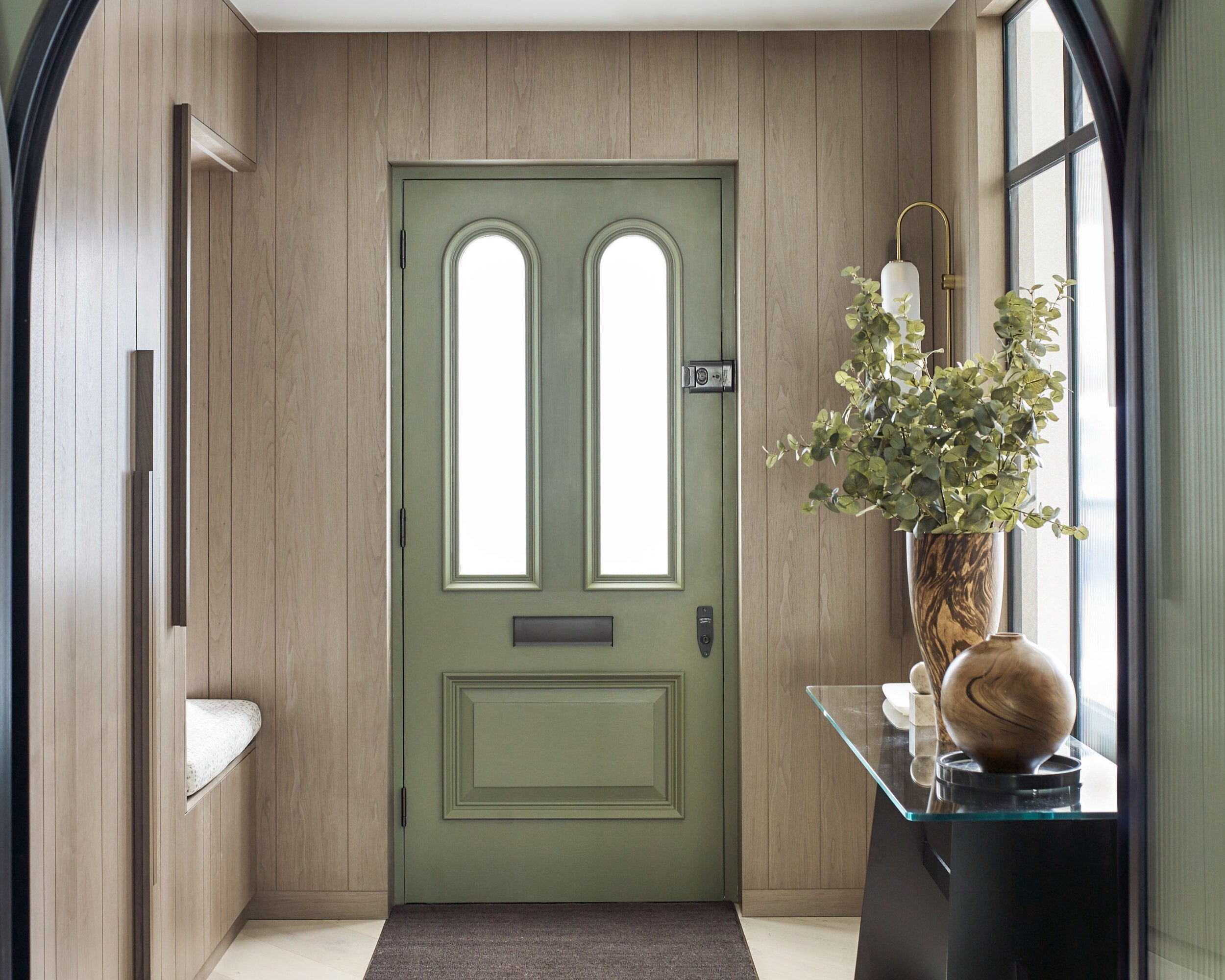
Creating beautiful colour schemes can be approached in different ways – sometimes we are tasked with creating a new décor scheme for a whole house or we work around existing features in listed properties where colours may not be chosen from scratch. Where we can, we consider existing pieces of artwork, perhaps a favourite sofa or a spectacular rug … or we may have carte blanche to create the entire scheme from our own interpretation of the project’s geographical location, client’s wishlist and our own unique vision of what will make a space ‘sing’. We recently completed a project in a Grade II* Listed property where aside from decorating, we weren’t allowed to touch much else. Having to use paint as the key ‘decorating tool’ really illustrated to us how strong the performing power of choosing the right paint can be. When it comes to our residential work, we often start with living room colour scheme as the heart of the home.

Choosing paint colours for the living room
When choosing paint colours for the living room we start off with a discussion with our client to pin down the overall ‘feeling’ they would like to achieve in that particular room. They may want a ‘light and airy’ feel, or perhaps a ‘warm and cosy’ ambience. That gives us a steer on the directions we should go for ideas for living room colour schemes. We also look at all the items that will remain in that particular room and naturally take lots of photos so we can refer back to colours and patterns that we may find in existing pieces of artwork, the view of the garden or the shades of warmth in an existing floorboard.
The best colour schemes for living rooms, we think, are those that have a little bit of space for flexibility, with the option of introducing new ideas, textures, shapes and patterns. Sometimes we may create a very simple ‘background’ colour scheme, perhaps consisting of very neutral paint shades – perhaps subtle tones of ivory, grey, or taupes. The Architectural Colours palette from Paint & Paper Library has sets of five graduated shades, for example, Slate 1 which gradually darkens through five steps up to Slate 5. Using these graduated shades is a fool-proof way of graduating colour from the bottom to top of a room … use a Canvas V for skirting board, perhaps then work upwards for wall, dado, above the dado, cornice and so on to the lightest shade for the ceiling. Once we have got a ‘background’ theme or shade to work with, it becomes more interesting to add soft furnishings, such as cushions, pouffes, fabric blinds and lampshades. All home colour schemes have to start somewhere, and it might be that the crimson velvet sofa has to stay in position, but the colour scheme around it can change! If we are switching things up, but keeping certain items, we often think about a complete change of direction! So … if that statement sofa takes pride of place in a pale and neutral room, we might suggest ‘going for it’ by adding more vivid colour and intense patterns for the soft furnishings!
Think about ideas such as having a feature wall in the same bold colour as the sofa (or rug or cabinet) and making that colour the mainstay of the whole scheme. When asked ‘how do I choose a colour scheme for my living room?’ we often encourage our clients to tell us about their favourite objects in the house, which may be a painting, a sculpture, a piece of upholstery or a much-loved inherited rug. We can then reference those colours within the new colour scheme, to link the ideas together. Then it becomes a matter of pinning down the best shades to use that will enhance the links between wall colours and soft furnishing colours. It doesn’t have to be complicated. For example, that imaginary crimson sofa we’ve referred to could be dressed with vibrantly printed cushions in turquoise, jade green or flamingo pink, drawing in other colours to the palette. (And by the way, if you’re looking for multi-coloured cushions to bring life to your schemes, take a look at the printed velvets in the Omega Prints collection from Linwood Fabric!).

Choosing paint colours for a home office
As far as home office colours schemes or schemes for studies are concerned, we usually tend to suggest soothing, gentle paint shades. Soft tones of mushroom, griege, pale green and muted grey may not sound terribly exciting, but they do help to create a non-distracting background for work and study. On the assumption that most home office time is spent in front of a screen, the room should be calm and tidy. As far as soft furnishings are concerned, add interest, colour and texture with fabric blinds, a comfy upholstered chair for reading, and perhaps a colourful carpet or rug. Keep the scheme uncluttered, with room for an inspirational pinboard for photos, illustrations (and your fabric and paint colour samples!) to bring real life into the room.

Choosing paint colours for the bedroom
For bedroom colour scheme ideas, we work on the basis that it’s a really personal room, so we always try to work around our clients favoured shades. Do they like or dislike patterns, should the bedroom include occasional items such as an ottoman or armchair, do they want a dramatic upholstered headboard or something understated and simple? Is there an en-suite colour scheme that needs to be considered? Which is the best colour for a bedroom? Well, there is no catch-all answer to that one! If it’s a guest room, some of our clients like to do something colourful and different, or they may want to keep it very neutral and simple. Bedroom schemes often work best when each bedroom has a similar predominant colour, such as off-white or pale green or pastel blue, and then we build on those shades with soft furnishings to add emphasis and contrast. It’s also important of course if we’re doing a whole-house project, that each bedroom works in harmony with the other rooms. The exceptions are children’s bedrooms, which can be a jolly good excuse for thinking ‘out of the box’. We will take a look at ideas for children’s rooms in future stories for our blog!